No products in the cart.

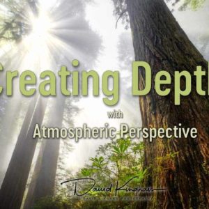
Understanding Colors and Tones in Lightroom
$39.00
Software used: Lightroom Classic CC
Course Length: 2 hours, 45 minutes total (broken up into short segments)
$39.00
Software used: Lightroom Classic CC
Course Length: 2 hours, 45 minutes total (broken up into short segments)
Mark M (verified owner) –
I thought this was an outstanding course. The way the courses are laid out, with ideas covered in the first few videos, followed by numerous examples putting those ideas to work, was super helpful. I like lots of examples to drive home the ideas. I’m now using these techniques on my images. Thanks David!
Demetri C (verified owner) –
This course is a surprise, a real sleeper. I thought I had my LR workflow nailed. I also own courses from other instructors. I’ve used LR for 15 years. What could anyone else teach me? I was wrong.
I went through the 2.5+ hours of course videos and immediately reworked some of my completed photos in LR. The results were magical. David’s technique and workflow are unique and spot on. This is the way to go.
He’s an excellent teacher who delivers instruction A-to-B without diversions. I just loved the course and can’t say enough about it. Thank you!
Demetri C
Bill McDermott (verified owner) –
This video tutorial moved David into my list of top post-processing instructors. The methods taught in these lessons take the guess work out of setting color and tone throughout the entire image’s dynamic range. I gained a better understanding of how and where to look at my photos before making adjustments. I believe my RAW workflow will become more efficient as a result. I’m very happy with the purchase and hope to see David produce more quality videos such as this.
– Bill McDermott
Jacob (verified owner) –
This new video by David is about Tonal Contrast. It provides the viewer with the concepts of tones and colors, relationship between Tonal Contrast and histogram, and also zone system and the histogram. In a departure from a more traditional use of the “Basic” and “Tone Curve” modules of the Lightroom David presents a innovative approach which results in a more pleasing image. Using about ten sliders David demonstrates how to set the appropriate WB and define the tones to achieve the best visual impact.
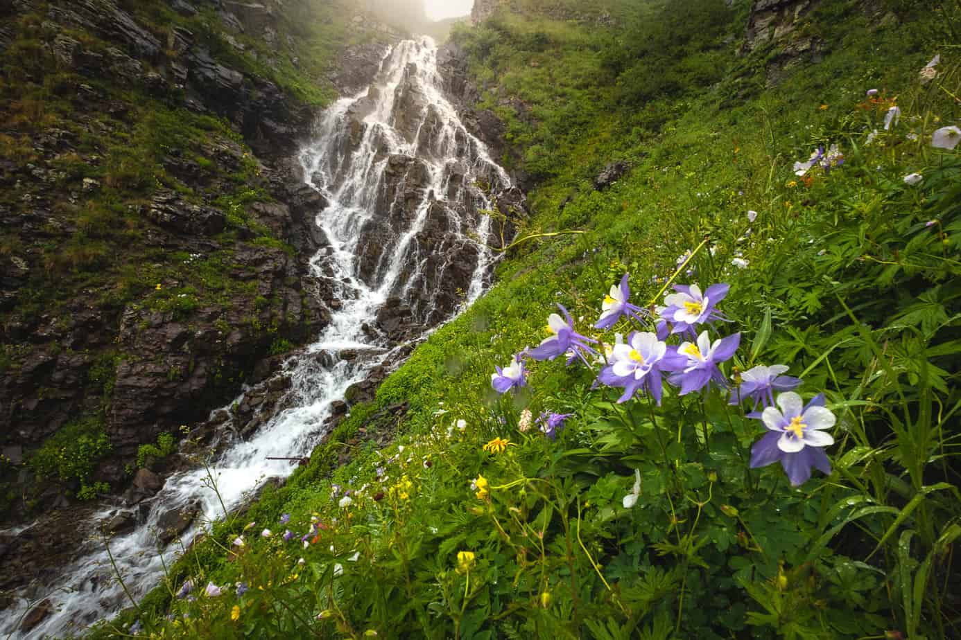
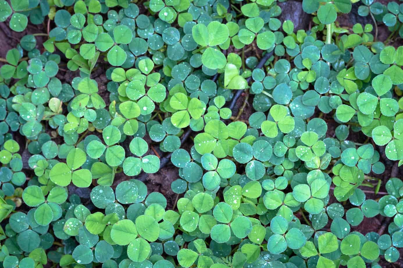
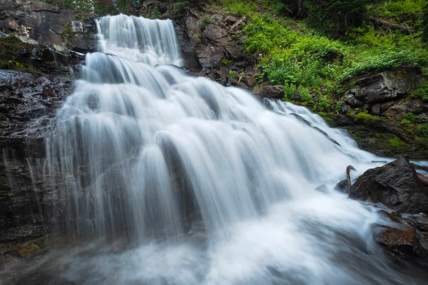
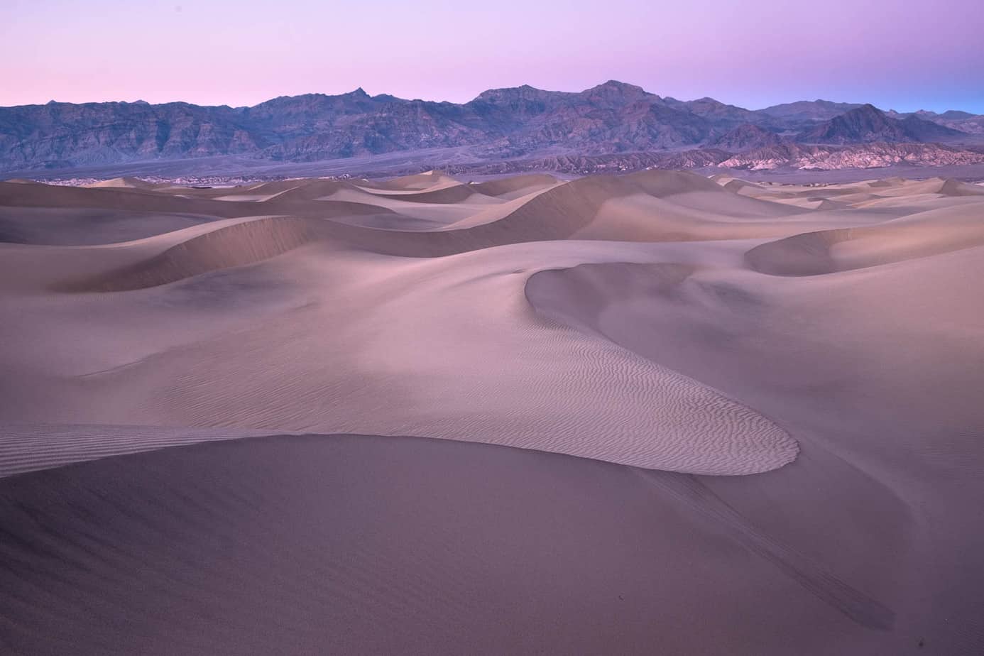
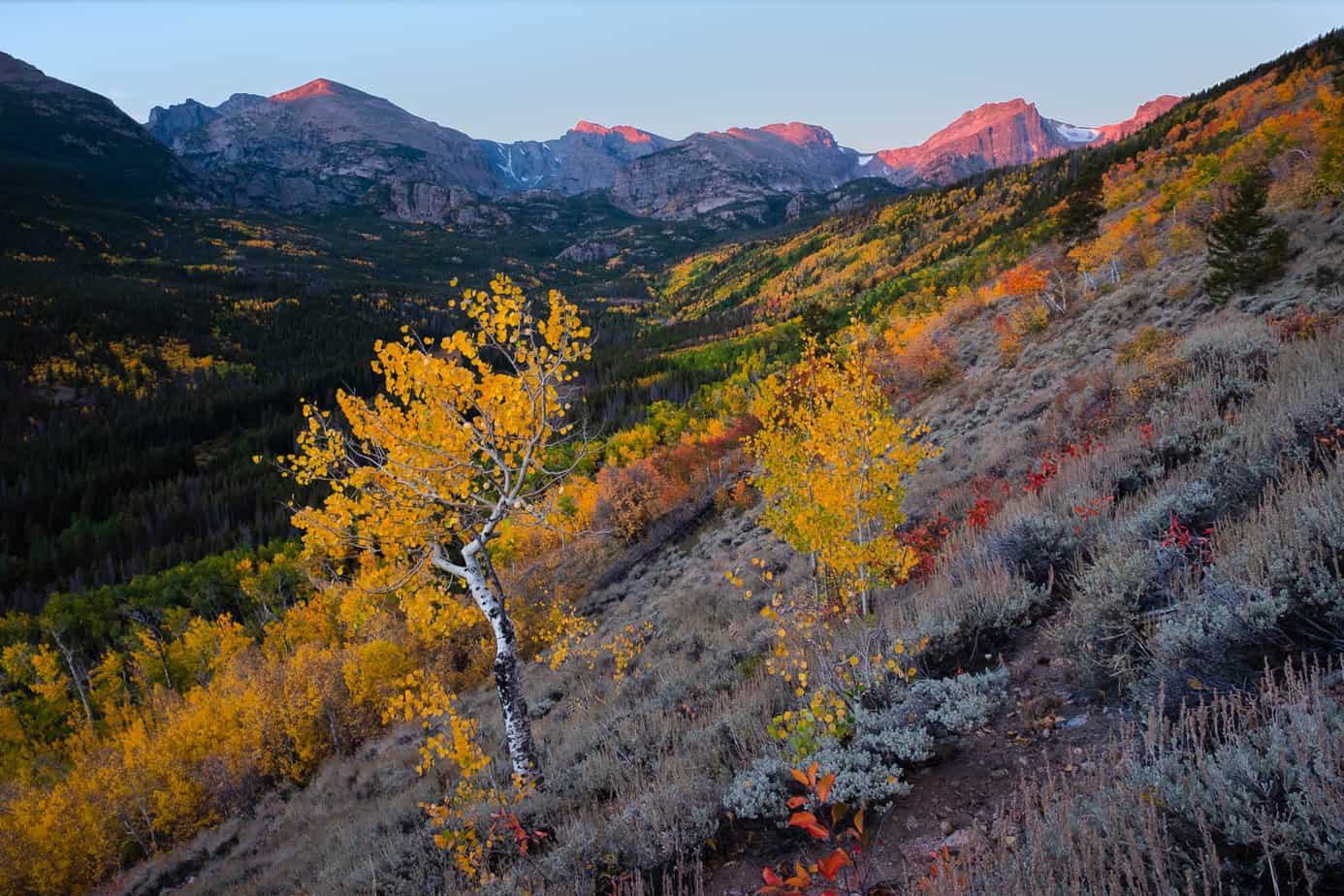
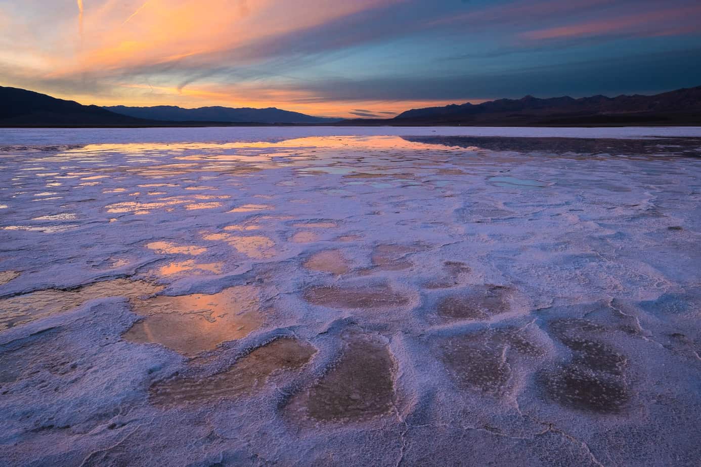
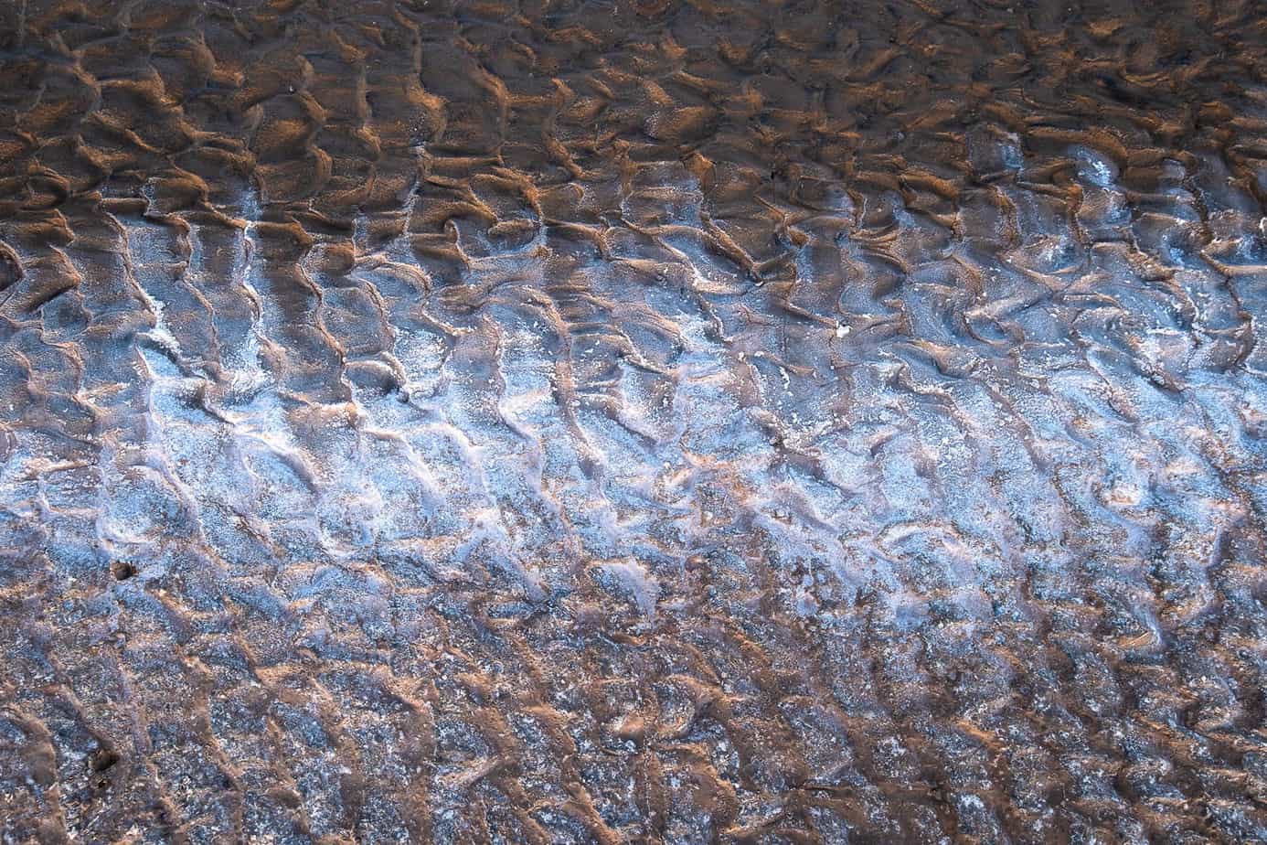
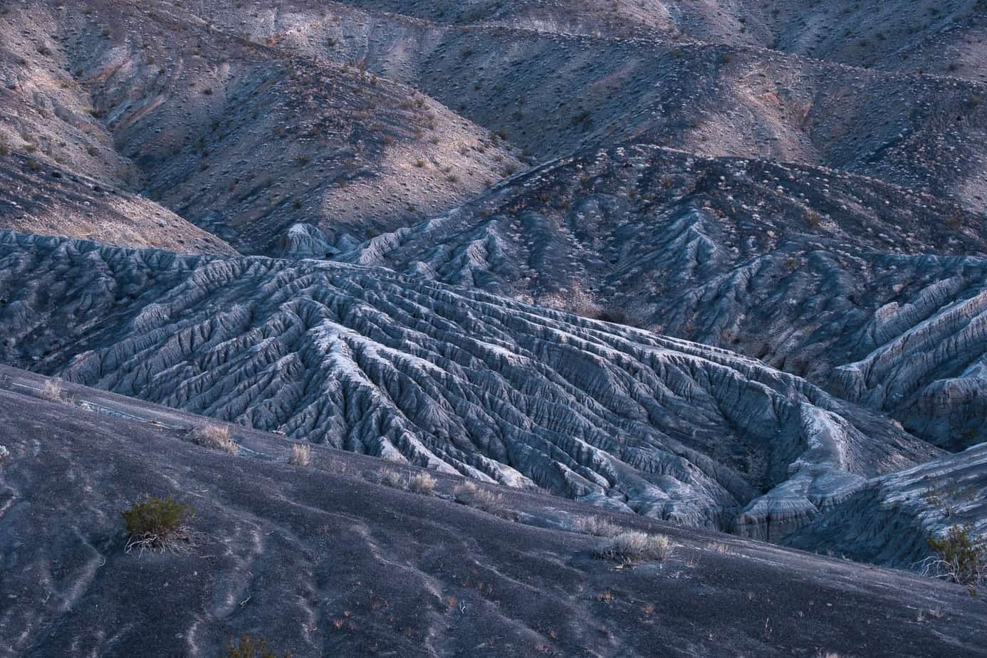
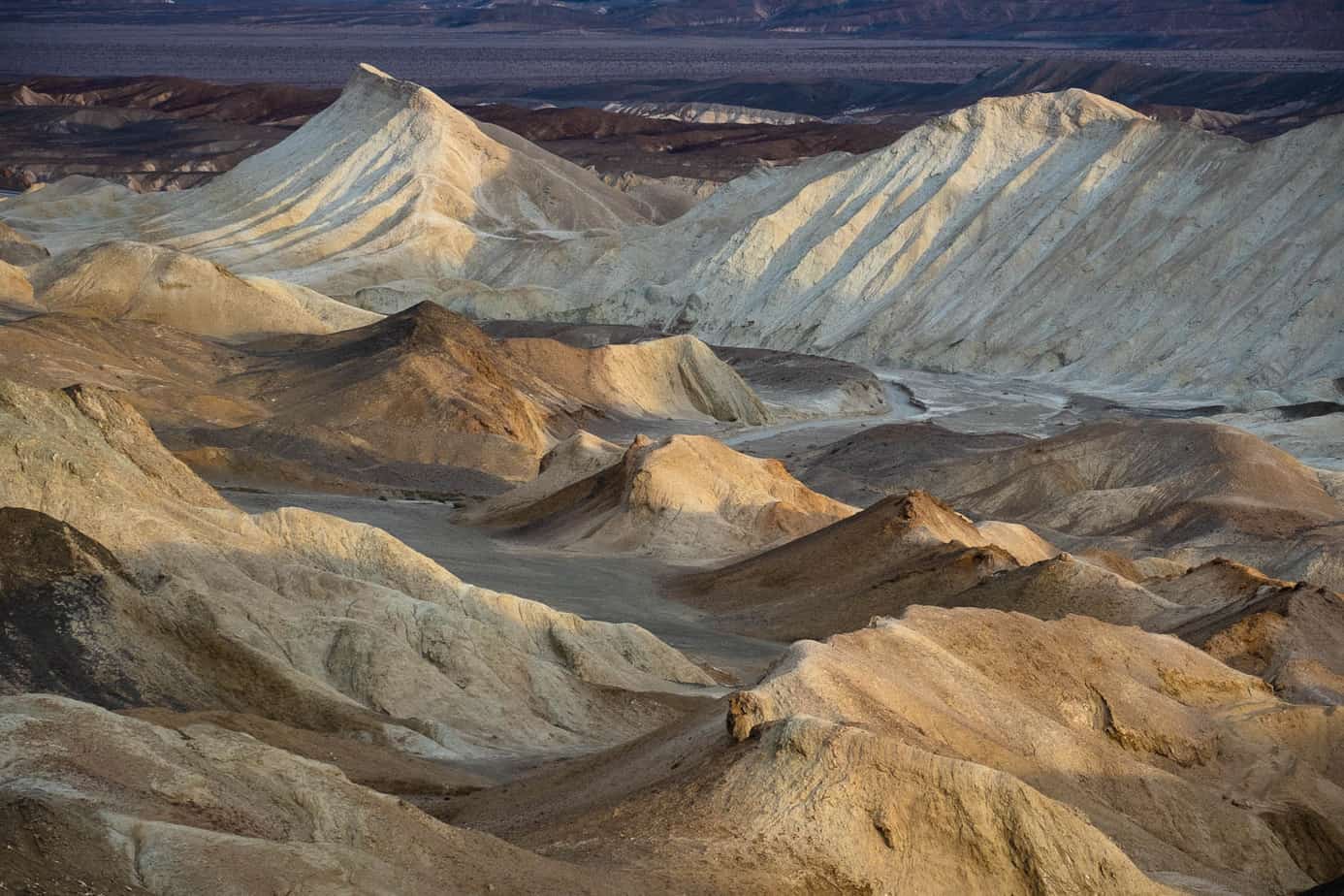
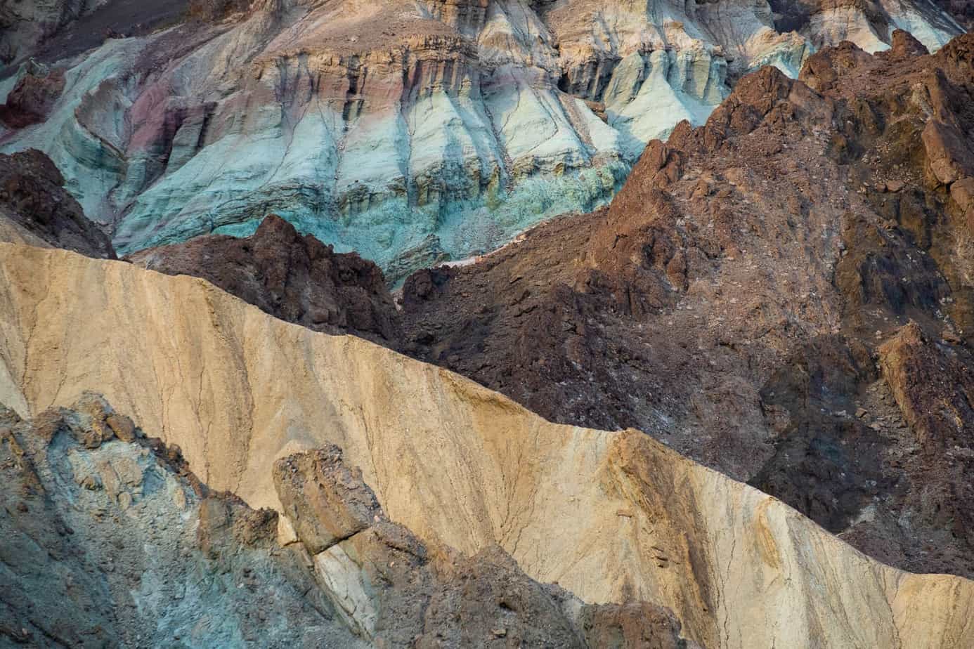
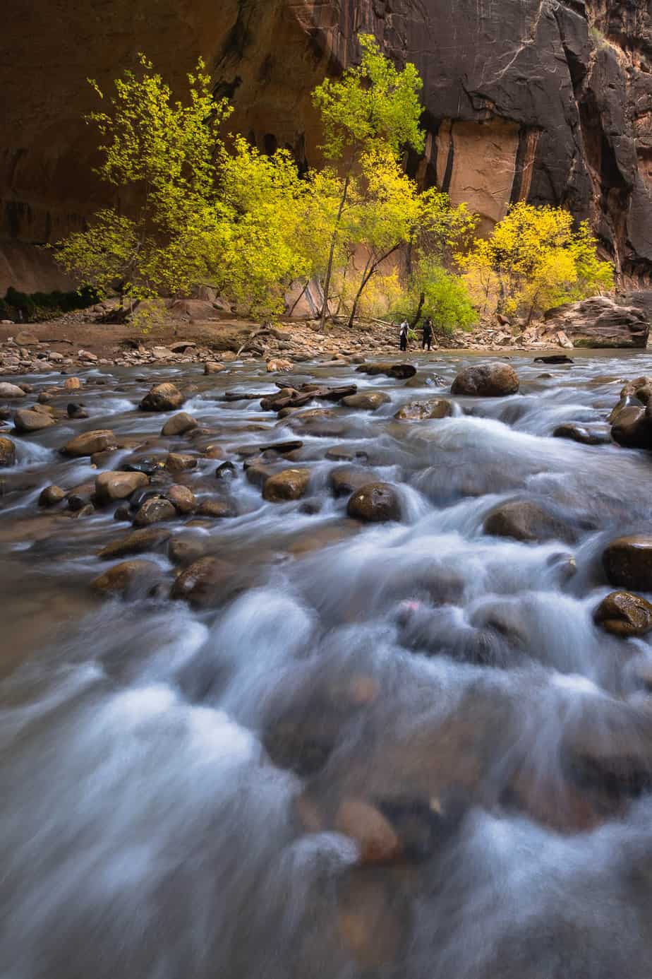
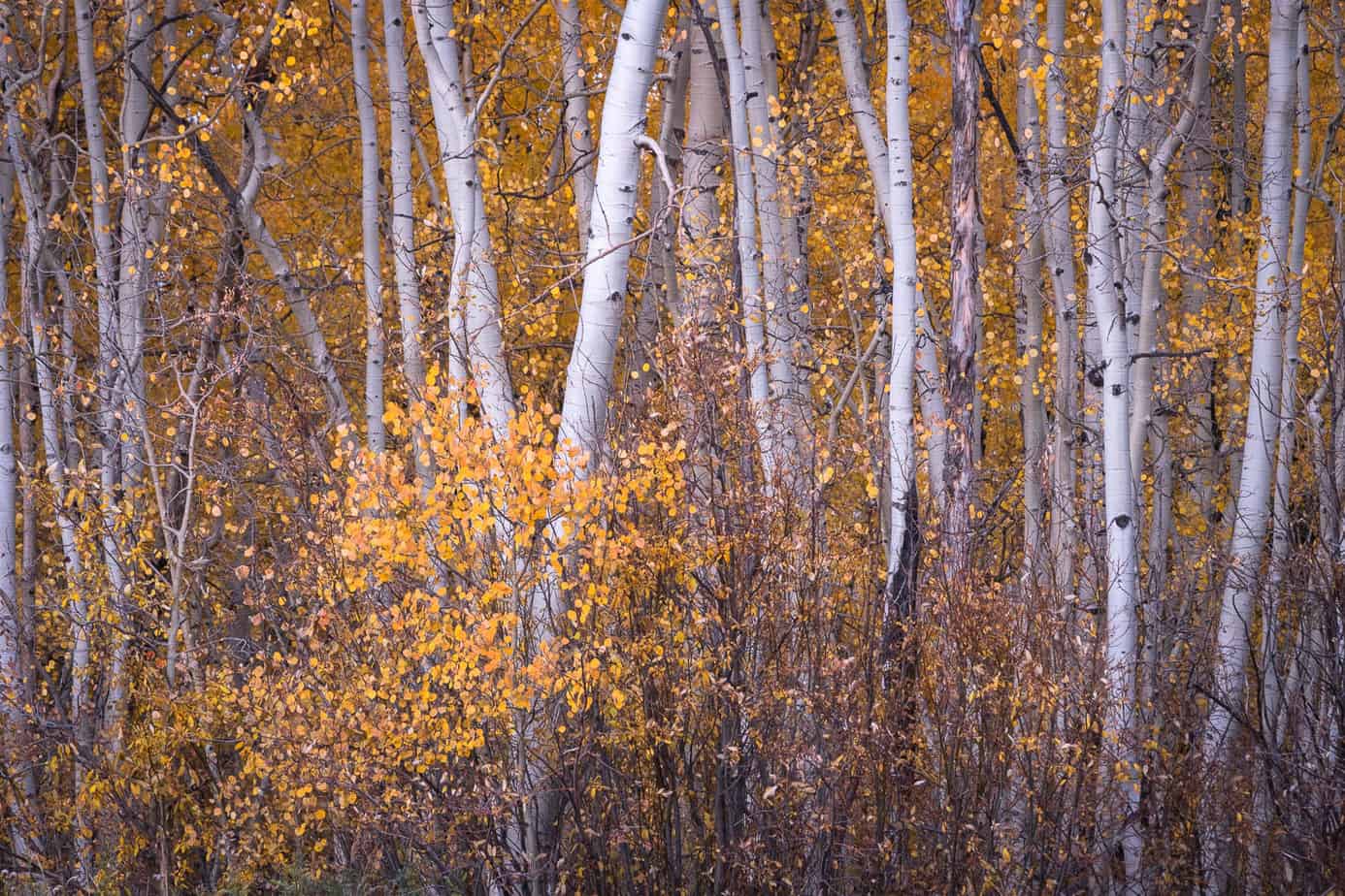
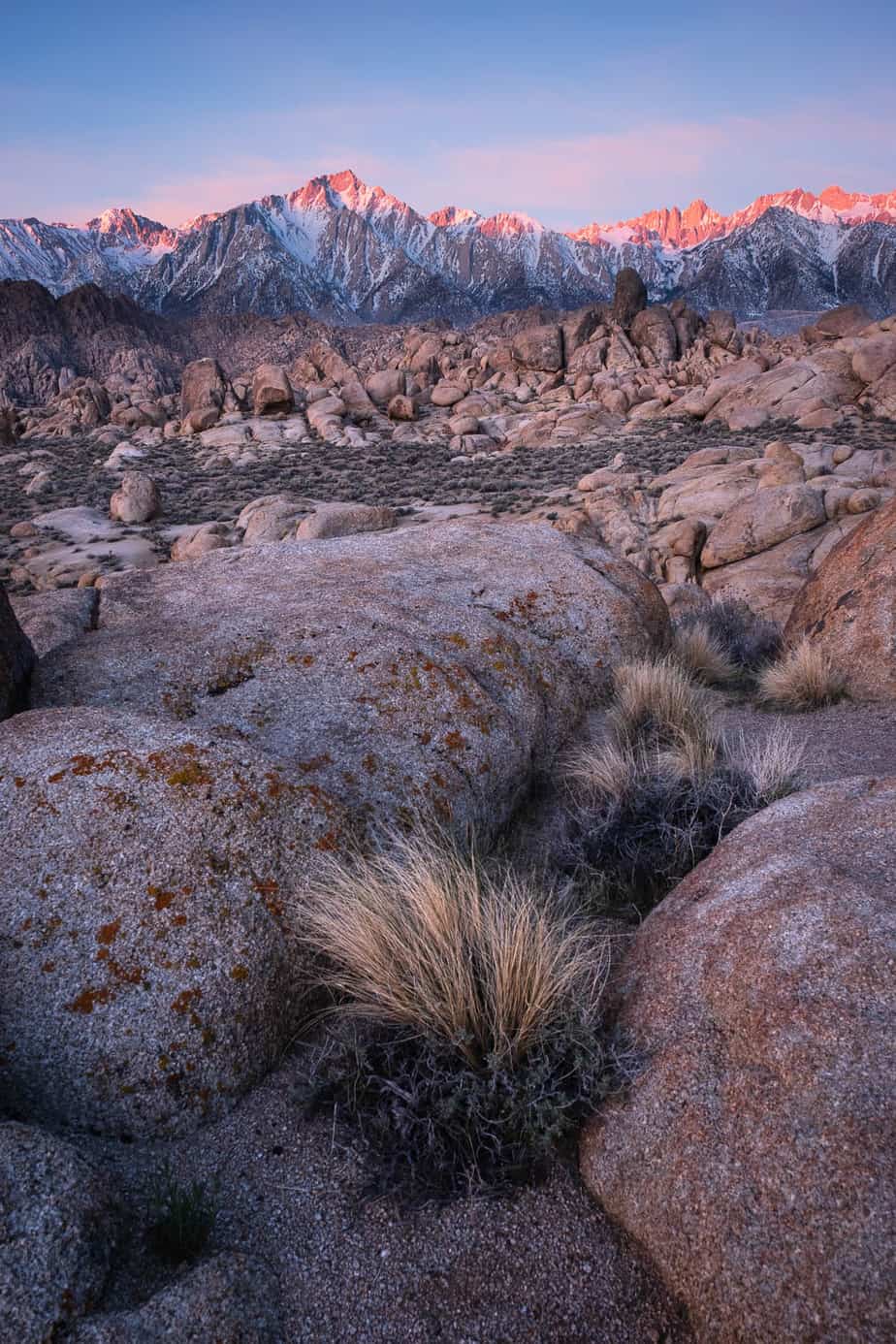
I find the video format very convenient and easy to use: the first five short videos cover the concepts – colors, tones, histogram and the zone system. The next twenty short videos are examples; they clearly demonstrate the practical implementation of the concepts and cover a wide range of landscapes: deserts, mountains, fall colors, streams of water, etc. The first few examples are simple and require global adjustments only; then the complexity increases and David demonstrates the use of local adjustments.
This video is a valuable tutorial for those who want to break out of a more traditional approach and improve their post-processing skills.
Highly recommended!
Jacob